Hi all!
Our new reports give much more flexibility in the ways you can see data than before, but you may wish to display charts that have not been included in the report. Due to the reports now being available in Excel, you can produce your own charts as well.
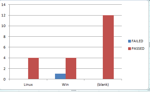
Let’s assume that you want to create a bar chart showing Run Status of your tests based on operating system (where operating system is one of the custom fields). This example will show you how to produce this chart using Practitest and Excel.
To start, produce a New Report…Go to Reports in Practitest and select ‘New Report’.
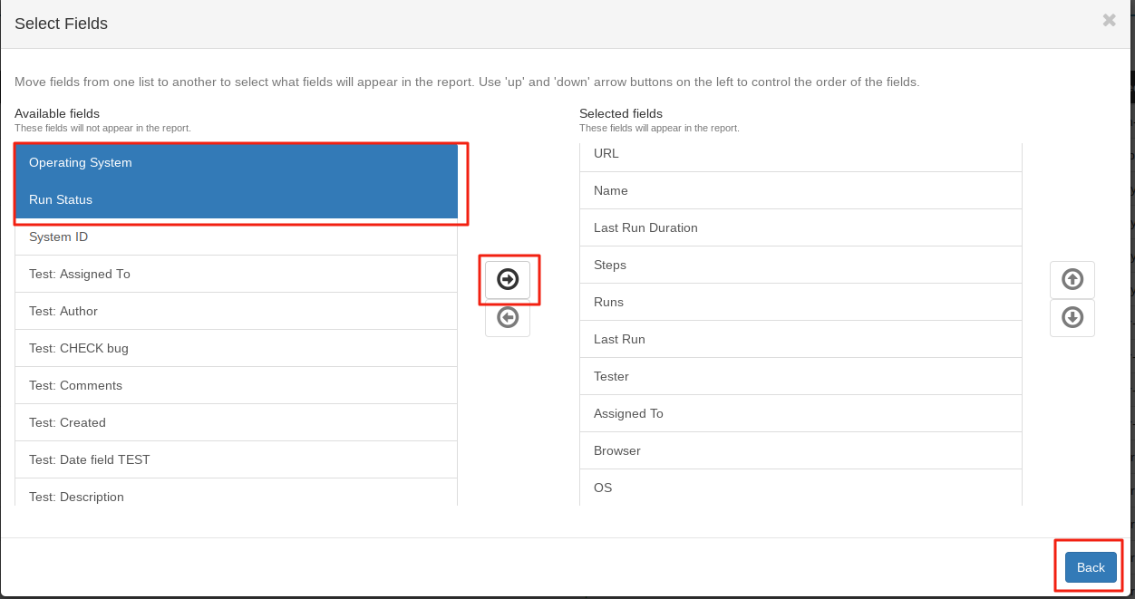
Make sure that the fields for your charts are going to be in the report. If not select them and move them to the the Selected fields column.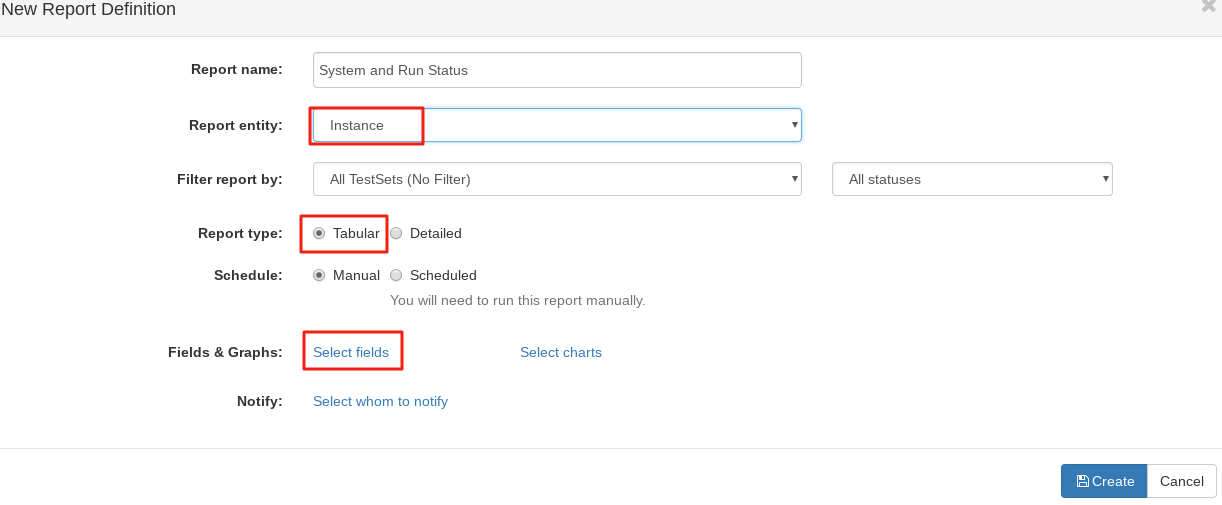
Then click ‘Create’ to create the report. Open the report in Excel and select the data tab.
![]()
Highlight the columns you wish to include in the report. (in my case the Run Status and operating system columns).

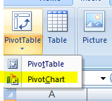
Now Click ‘Insert’ in the Ribbon Bar.
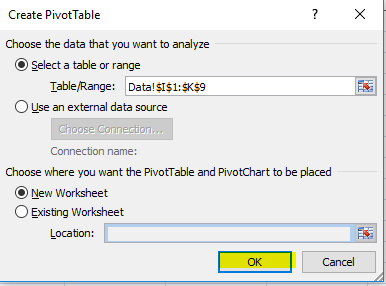
You will see pivot tables with an arrow under it. Click the arrow and select ‘Pivot Chart’.
Accept the default options in the first window and click ‘ok’.
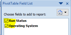
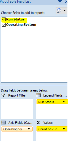
Put ticks in the checkboxes for the fields to add to the chart.
Now drag the Run Status Line to the count box and then drag it again to the Legends box. (what this does is make the count of run status the y-axis of the graph)
You should now see your chart on the screen